WILD PUP
Walk down any pet food aisle and the bags start to blur together. Long ingredient lists, words you can't pronounce, and a lot of promises that are hard to take at face value. Wild Pup was built to cut through all of it. The idea is simple: pure ingredients, wildly healthy, with just eight real things in every bag and nothing to hide. The hard part was making that simplicity feel like a strength instead of a shortcut, and building a brand bold enough to earn a dog owner's trust at first glance. Here's the visual identity and packaging I designed to make "pure" look every bit as good as it sounds.
Scope
— Logo design
— Typography and color
— Packaging design
— Additional brand elements
Credits
Designer: Aaron Ringer
lOGO MARK
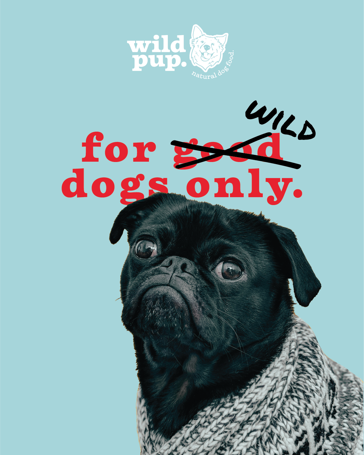
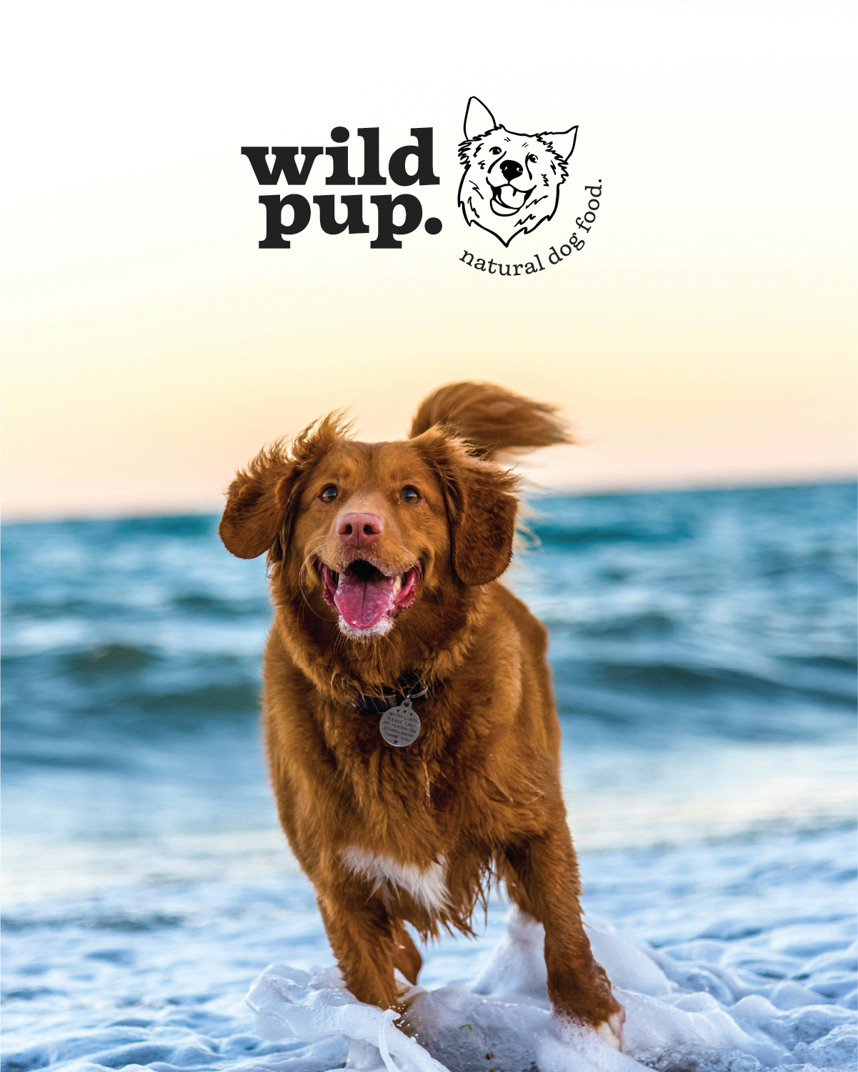
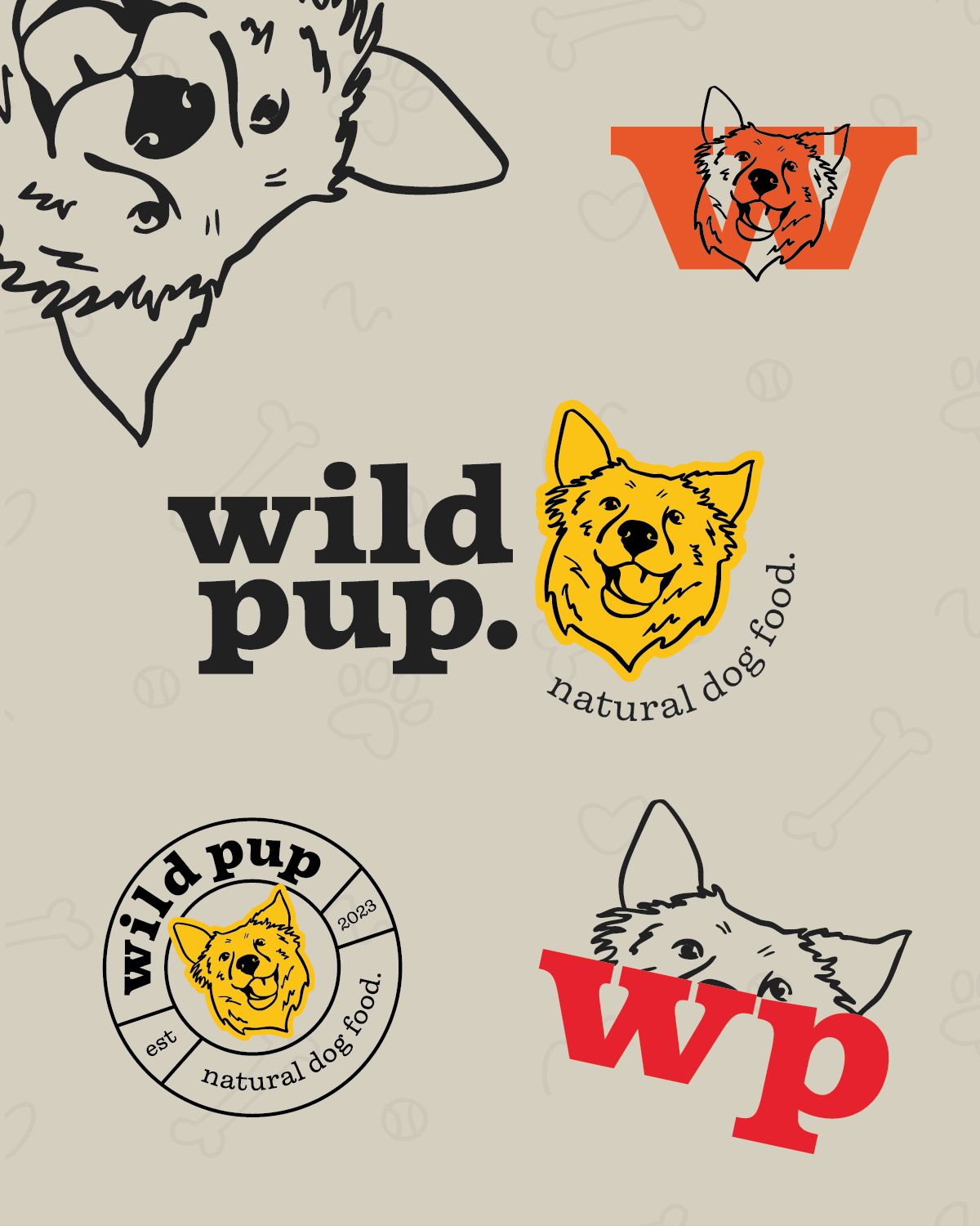
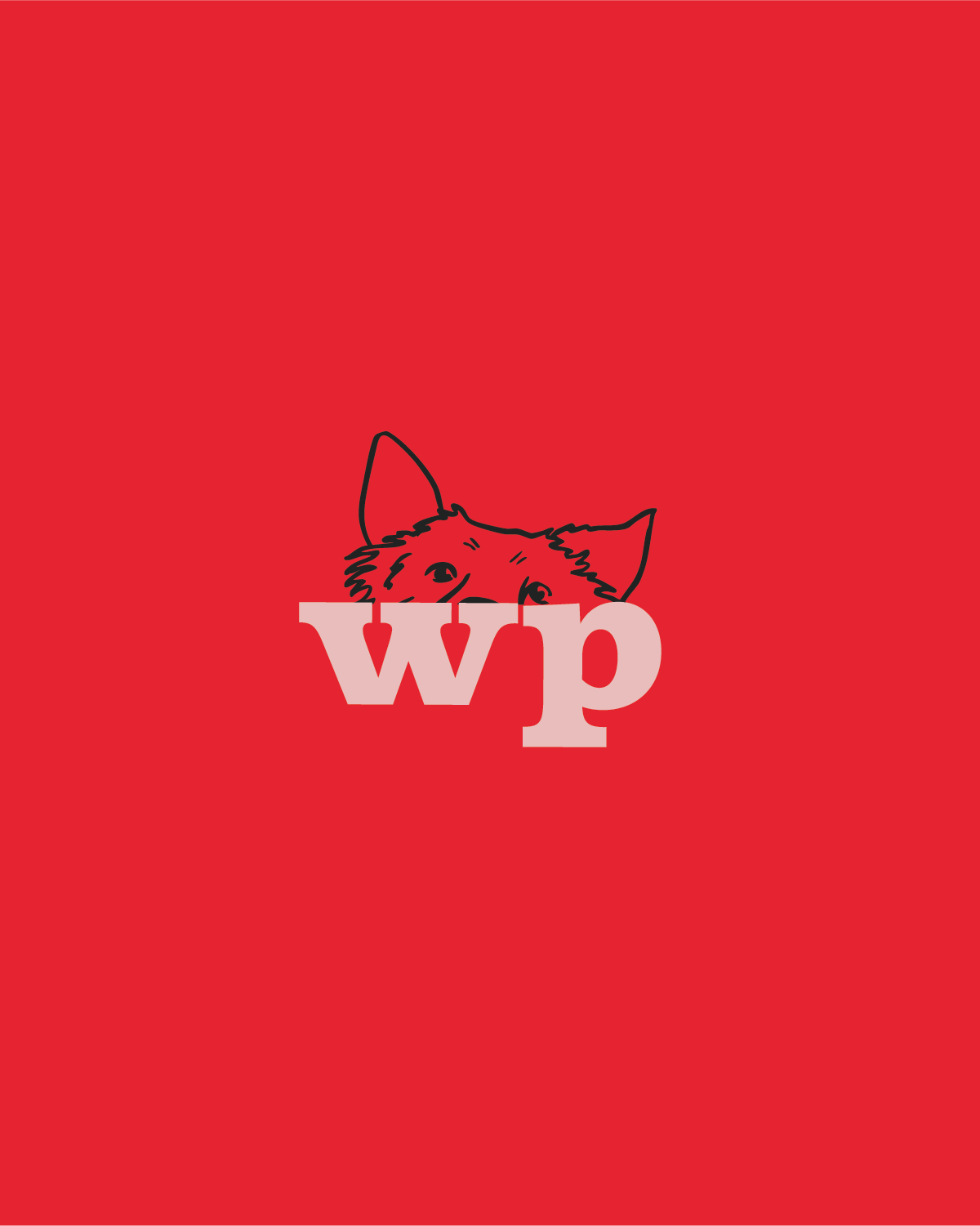
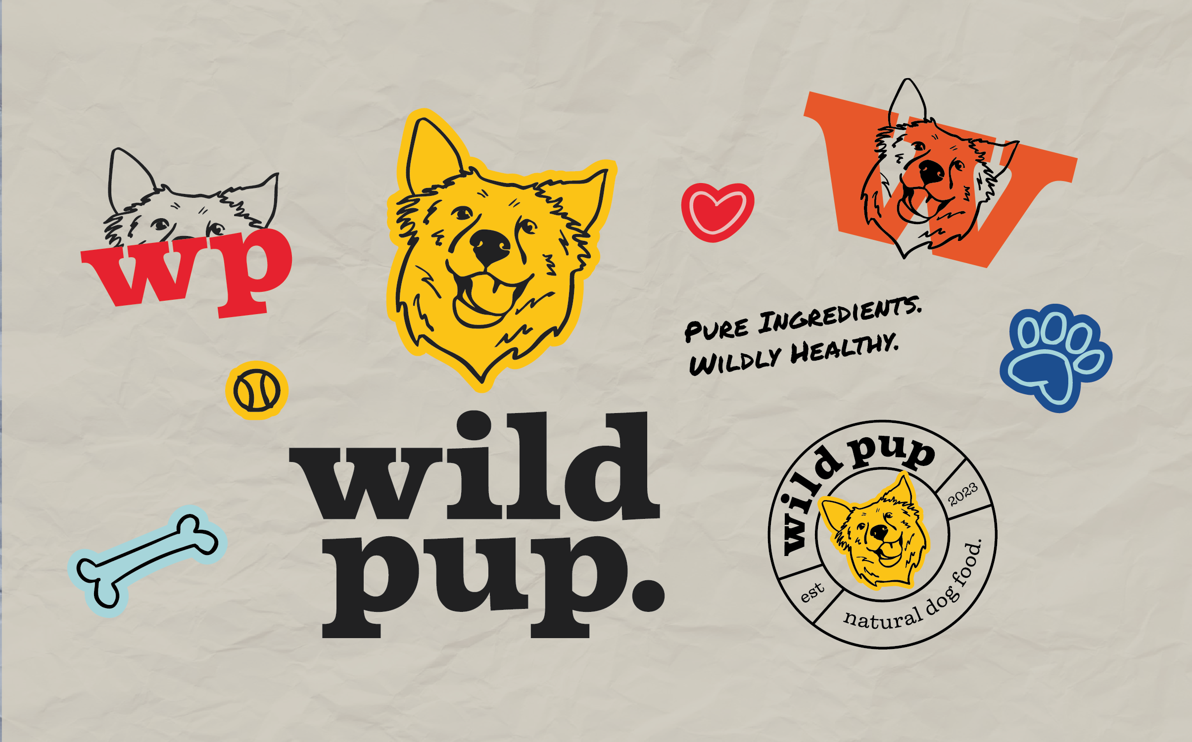
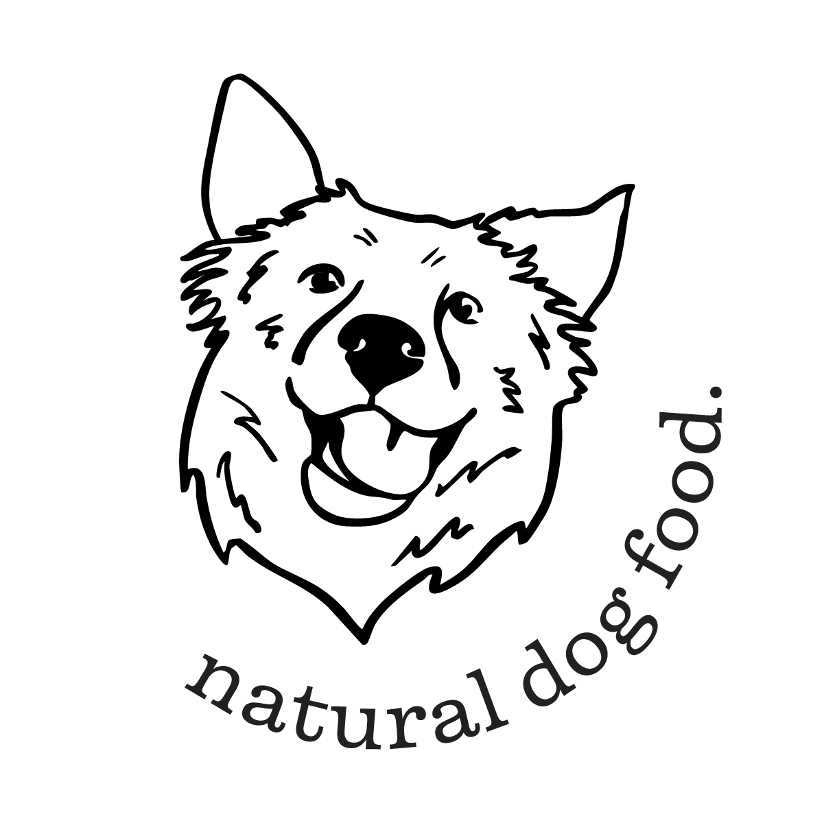
The mark is a single, hand-drawn dog, and it does the whole job at once. The loose, sketchy line gives it a wild, untamed energy that lives up to the name, while the open, happy expression keeps it warm and friendly. This isn't a stiff corporate icon. It's a real dog mid-tail-wag, the kind of healthy, joyful animal every owner wants at the other end of the leash.
COLOR PALETTE
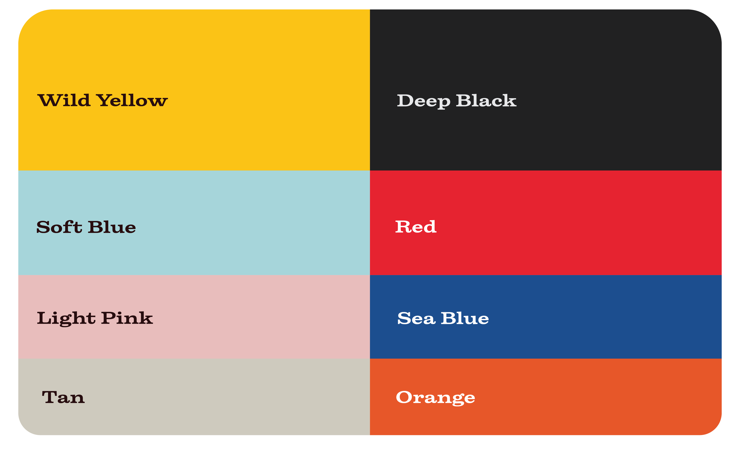
The palette is bold, bright, and a little unexpected, which is exactly the point. Natural dog food usually hides in a sea of earthy browns and greens, so Wild Pup goes the other way with a confident, energetic range that grabs attention from across the aisle. It balances loud, playful brights with softer, warmer tones, the same push and pull as the brand itself: wild energy on one side, pure and friendly on the other.

TYPOGRAPHY
Firelli leads on the headlines. It's a clean, classic serif that brings a touch of quality and warmth, the kind of typeface that feels natural and trustworthy without trying too hard. It's the brand at its most grown-up, the voice that says this is real food made with care.
Chainprinter does the talking in the body copy, and it's the smartest move in the set. The typewriter look reads like an honest label, plain, mechanical, and impossible to dress up, which is the perfect match for a brand built on transparency and a short ingredient list. Then Permanent Marker brings the personality. Used for the tagline and the loud moments, the hand-drawn marker ties straight back to the sketched logo and gives the brand its scrappy, playful, wild side.
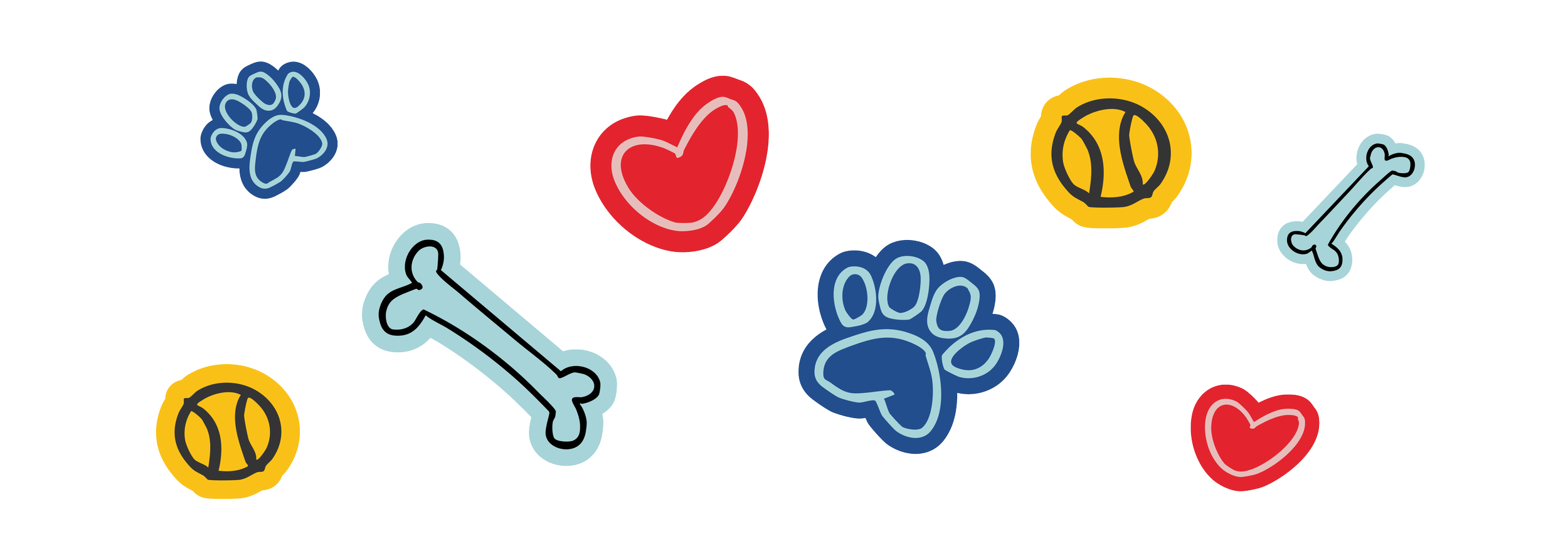
ILLUSTRATIONS
Paws, bones, hearts, and tennis balls, all drawn in the same loose, hand-sketched style as the logo. They're the universal language of a happy dog, instantly readable and impossible not to smile at, and they give the brand a playful energy that backs up the whole "recipe for play" idea.
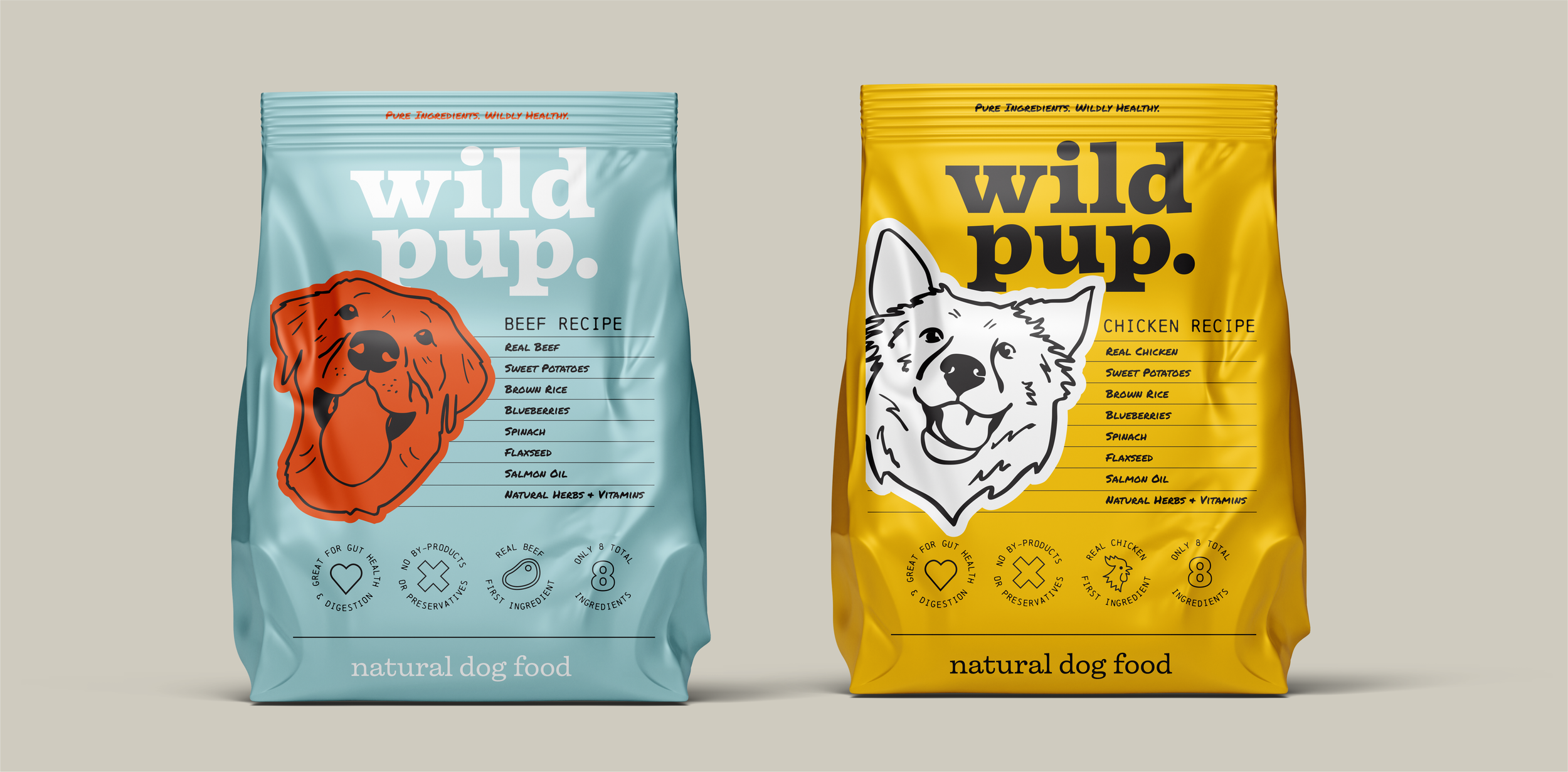
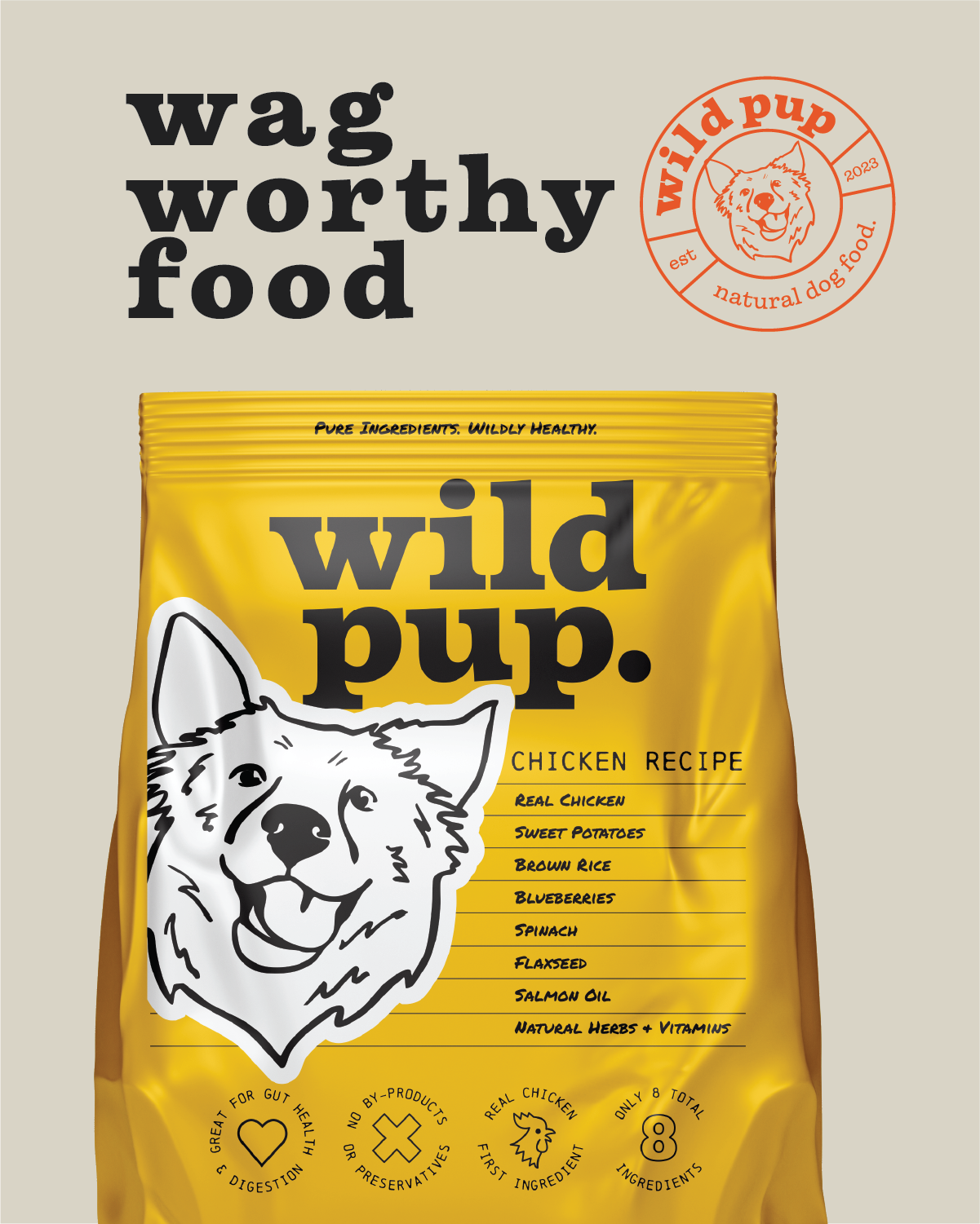
PACKAGING
The packaging is where Wild Pup proves it has nothing to hide. Each recipe owns a color pulled from the palette, soft blue for beef, bright yellow for chicken, so the lineup is easy to read at a glance and simple to grow over time. A bold, hand-drawn dog anchors every bag, full of the same personality as the logo, and the big "wild pup." wordmark makes sure the brand reads from clear across the store.