DAILYPOD
The Founder Taylor came to me with an idea that didn't exist yet in the podcast space: an app built around discovery, not just playback.
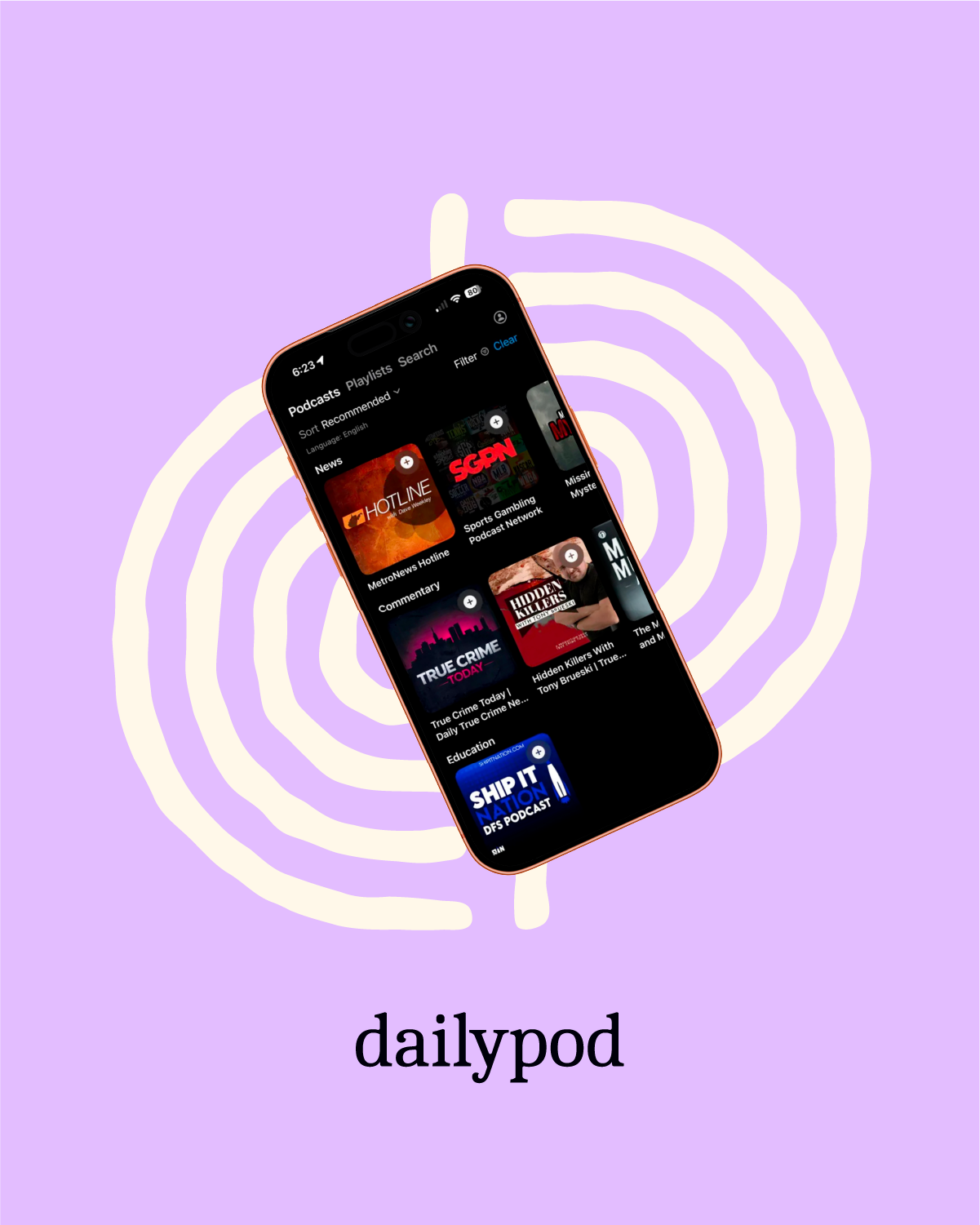
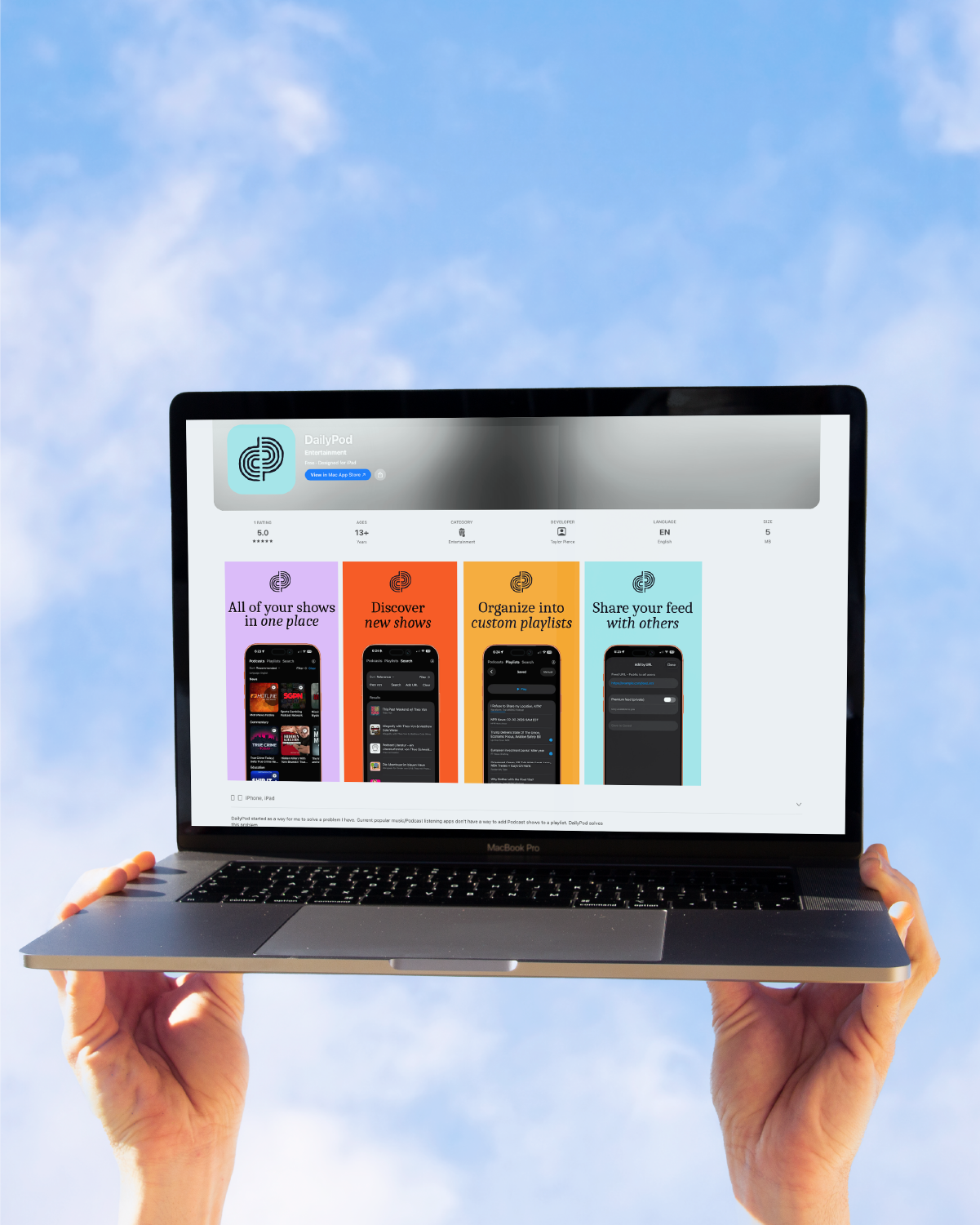
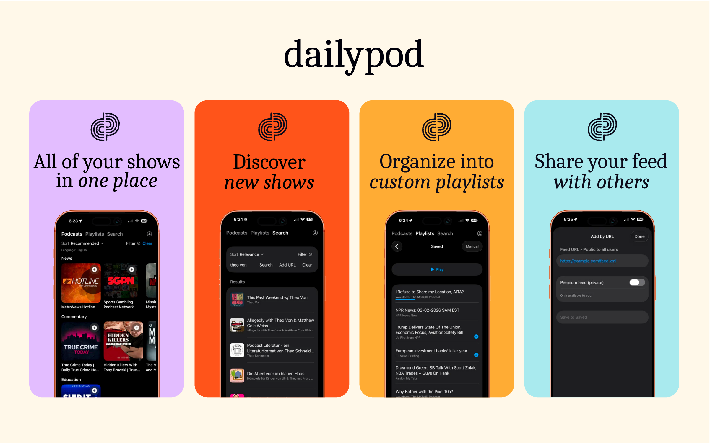
Most podcast apps assume you already know what you want to listen to. Dailypod flips that. It helps people find new shows worth their time, build custom playlists that fit their day, and share what they're loving with friends.
The challenge wasn't just making it look good. It was giving a brand-new app a visual identity strong enough to compete with players who've been in the space for years, and clear enough that people understood what made it different the moment they saw it.
Scope
— Logo design
— Typography and color
Credits
Designer: Aaron Ringer
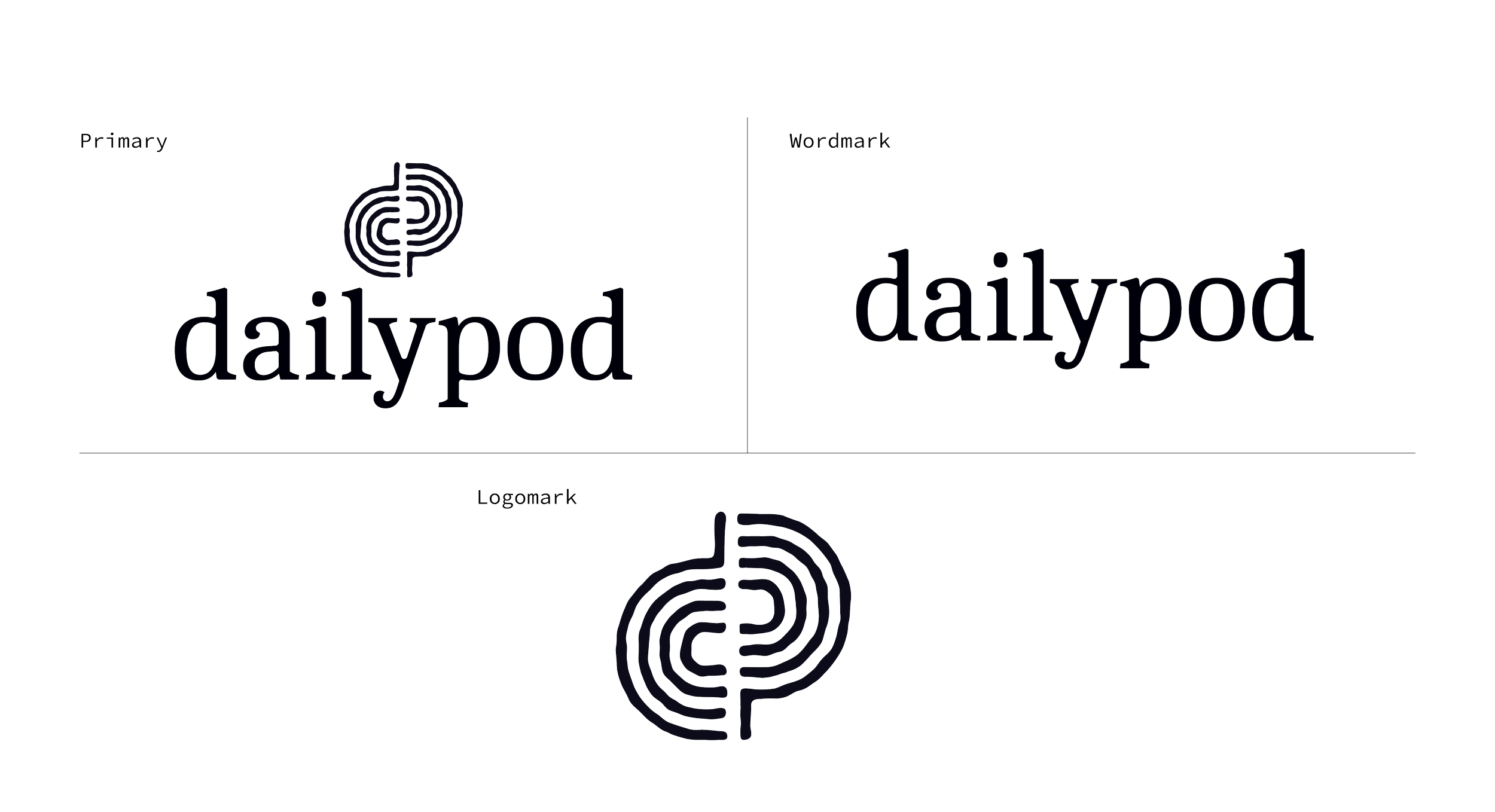
lOGO MARK
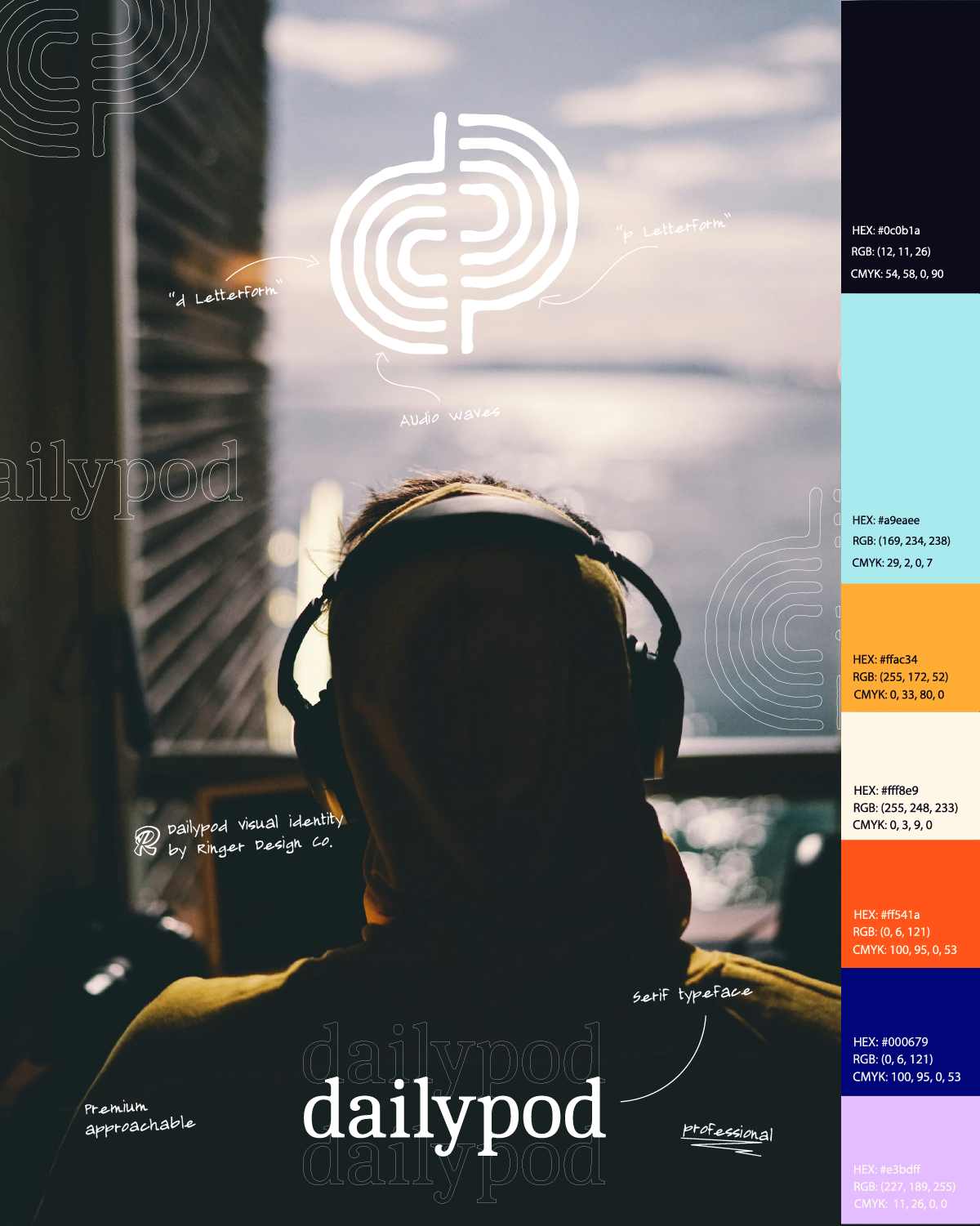
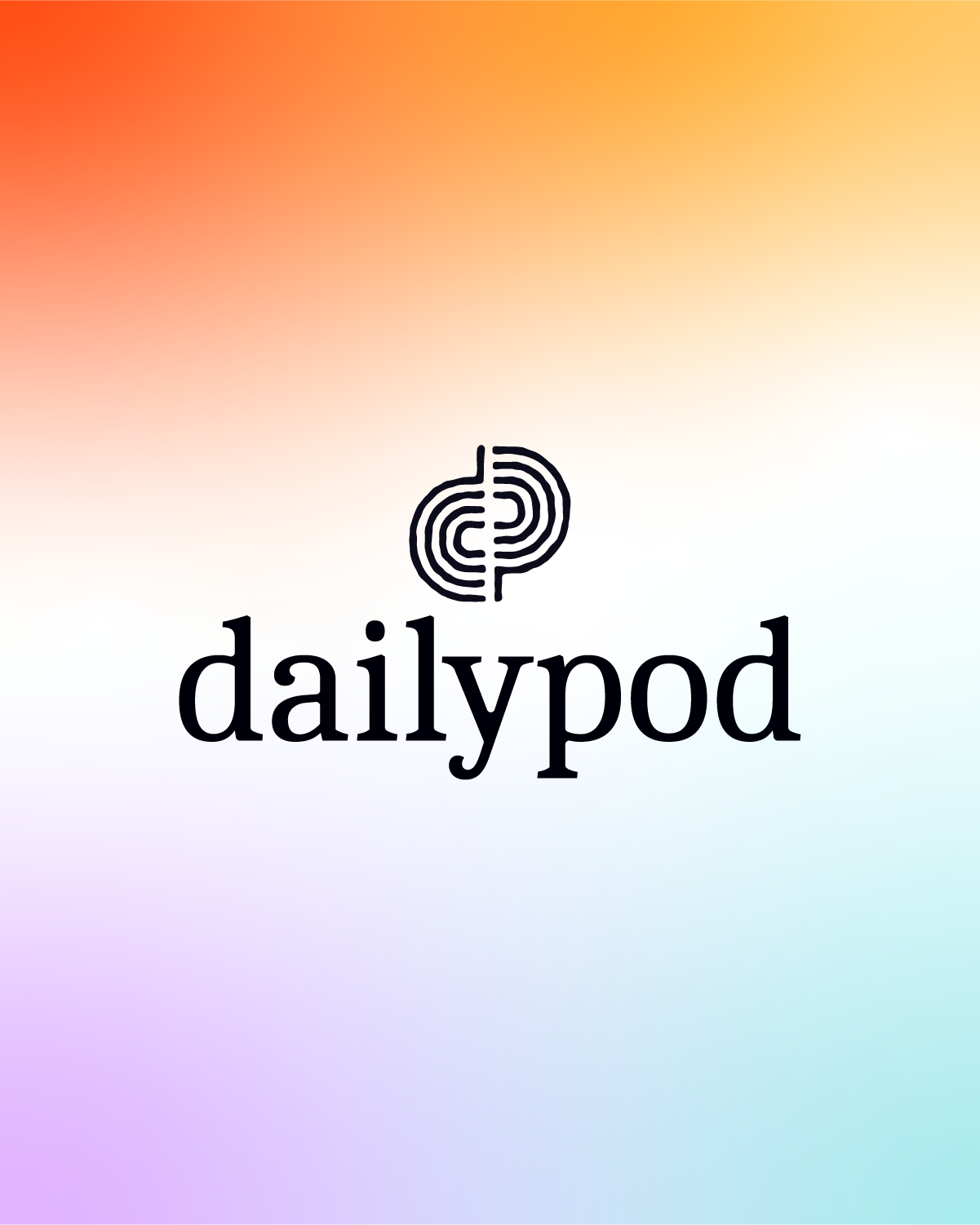
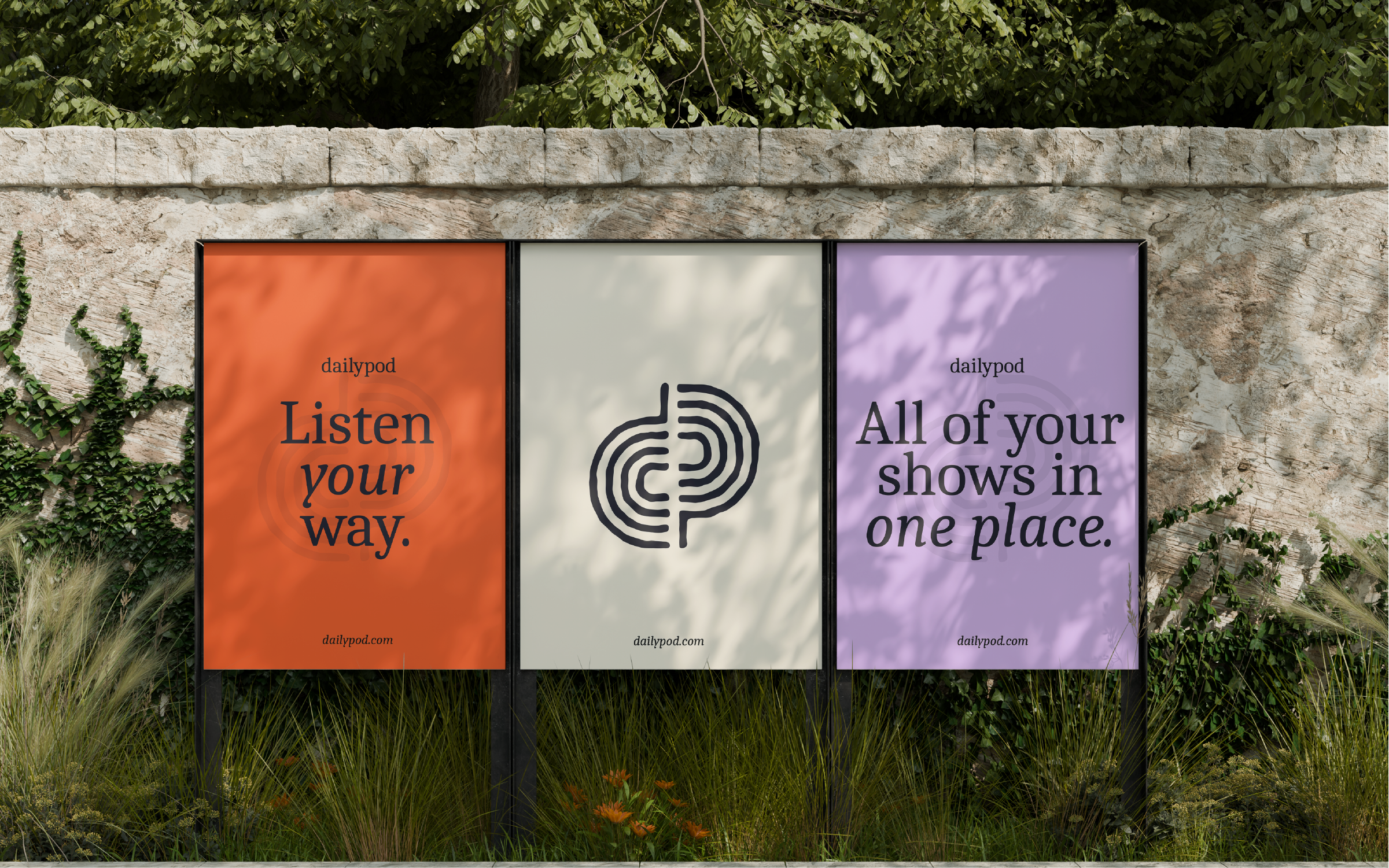
The Dailypod mark is built from two letterforms: a lowercase "d" and "p", each constructed from concentric rippling lines, like audio waves moving outward from a source.
It's a simple visual idea doing a lot of work. The rings nod to sound and signal without leaning on the obvious cliché of a literal soundwave or play button. Together, the d and p lock into a single logomark that reads clearly even at small sizes, like an app icon.
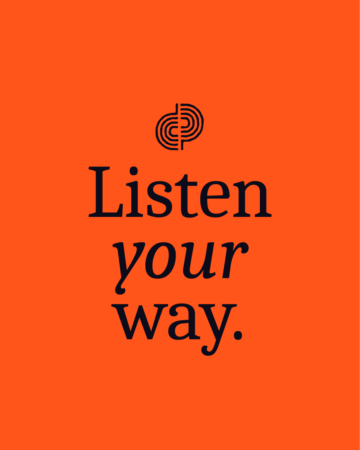
The wordmark pairs a warm serif with generous letterforms, walking the line between approachable and premium.
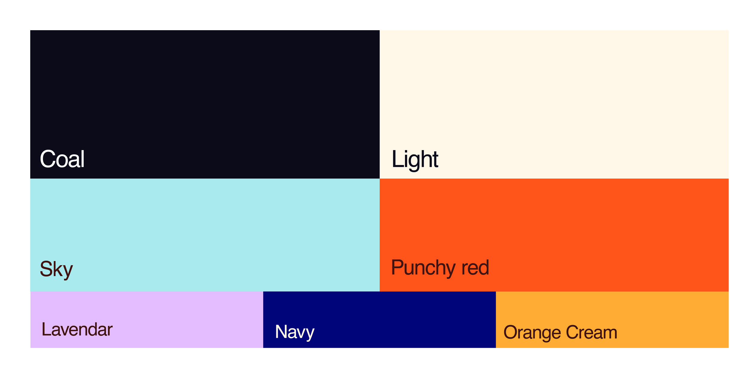
COLOR PALETTE
Charcoal and Light Cream anchor the Dailypod system, used for the UI, typography, and backgrounds that carry the brand day to day. Punchy Red and Sky Blue add energy as secondary colors for highlights and calls to action, while Navy, Lavender, and Orange Cream round things out as accents, giving categories and genres room to feel distinct without breaking from the brand.
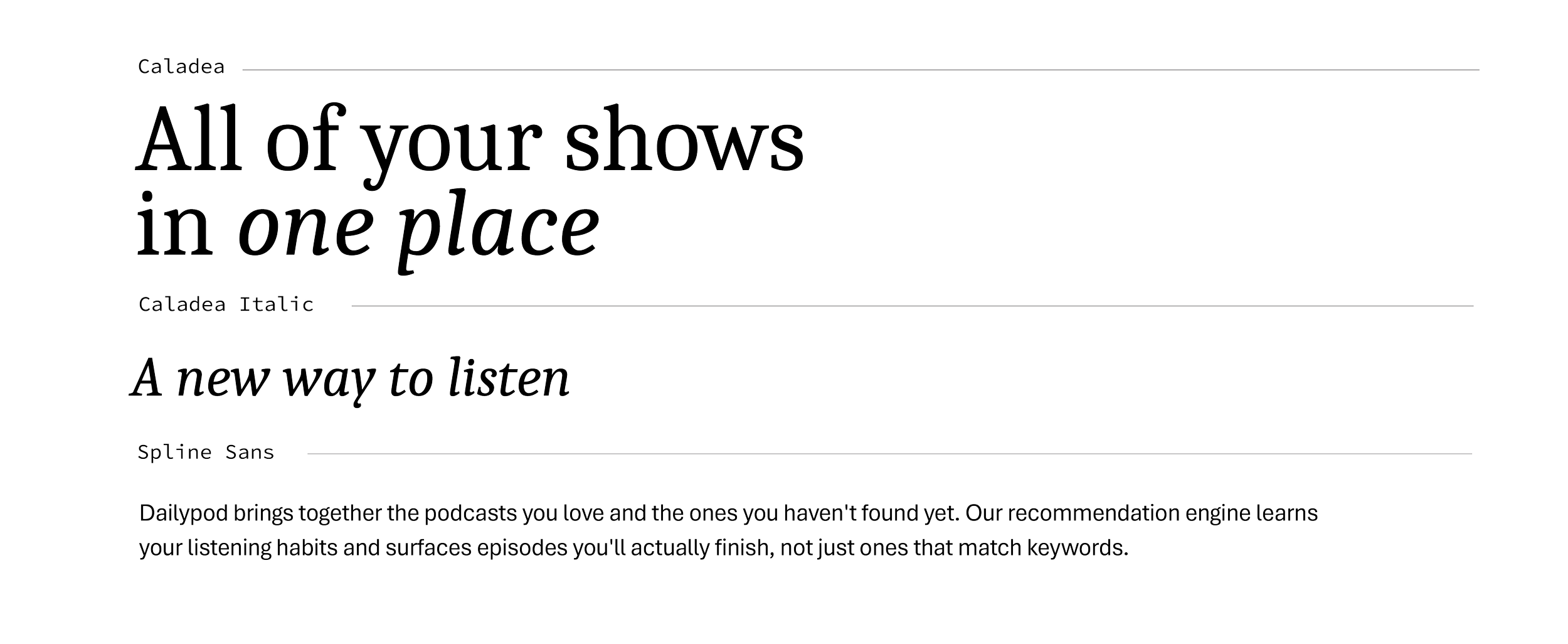
TYPOGRAPHY
Caladea, a warm serif, handles headlines and gives Dailypod its premium feel without losing approachability. Its italic carries subheads and adds a more personal, conversational tone where needed. Spline Sans, a clean grotesque, handles body copy, keeping everything readable on screen at any size. Pairing a serif with a sans gives the brand contrast between the editorial feel of a serif headline and the practicality of an app you use every day.
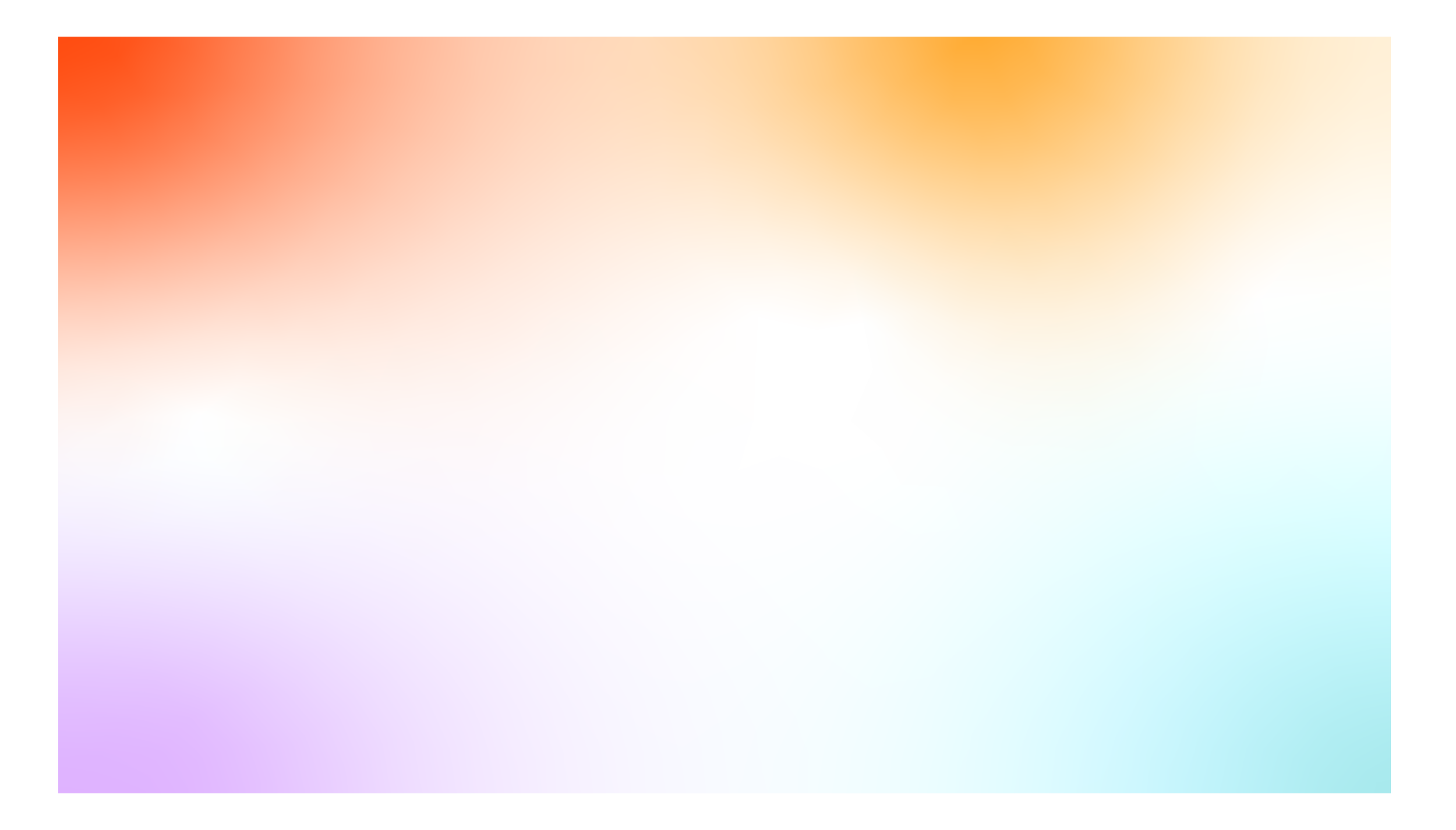
GRADIENT
Dailypod uses a soft, multi-tone gradient pulled from the brand colors, blending orange, lavender, and sky blue into a light, airy wash. It's used across backgrounds and app screens to add warmth and depth without competing with content. The gradient is what makes Dailypod feel less like a flat utility and more like a real, premium product with a bit of personality.