SUNNY OCTOBER BREWERY
Sunny October Brewery wanted their beer to feel like one specific moment: that perfect fall day when the sun's still warm, the air's gone crisp, and you've got nowhere to be. The brand had to capture that feeling and put it on a shelf. Here's how I built an identity and packaging system that does exactly that.
Scope
— Logo design
— Typography and color
— Packaging design
— Additional brand elements
Credits
Designer: Aaron Ringer

THE LOGO MARK
This logo mark for Sunny October Brewery captures the playful, laid-back spirit of the brand by blending two instantly recognizable symbols: the sun and a bottle cap. The outer jagged rays evoke a bright, warm October sun, while the smiling face at the center is framed by the distinct ridges of a beer bottle cap—subtly tying in the brewery’s core product. With its clean, bold lines and cheerful expression, the mark feels both modern and nostalgic, reflecting a brand that values good beer, good weather, and good vibes. It’s simple, memorable, and perfect for merch, cans, and tap handles alike.

COLOR PALETTE
The palette is warm, bright, and built to feel like that perfect October light. Pink and red carry the brand. Together they hit the sweet spot the whole identity is chasing, soft and easygoing on one side, bold and full of energy on the other. It's a pairing you don't see much in beer, which is exactly why it works. It makes Sunny October feel like its own thing the second you spot it.
TYPOGRAPHY
The type system gives Sunny October three voices that work as one. Cocogoose does the talking up front. It's bold, rounded, and full of confidence, the kind of headline that grabs you from across the room and sets the brand's easygoing energy. It carries the big moments, the names, and the lines that need to land first.
Montserrat handles everything else. It's clean, friendly, and easy to read, which keeps the brand approachable and lets the longer copy breathe without ever feeling stiff. Then Filmotype Lucky adds the human touch. Used in small doses, the script gives the brand a handmade, personal warmth, like a note left on the can just for you. Together the three keep Sunny October feeling loud where it counts, clear where it matters, and warm all the way through.
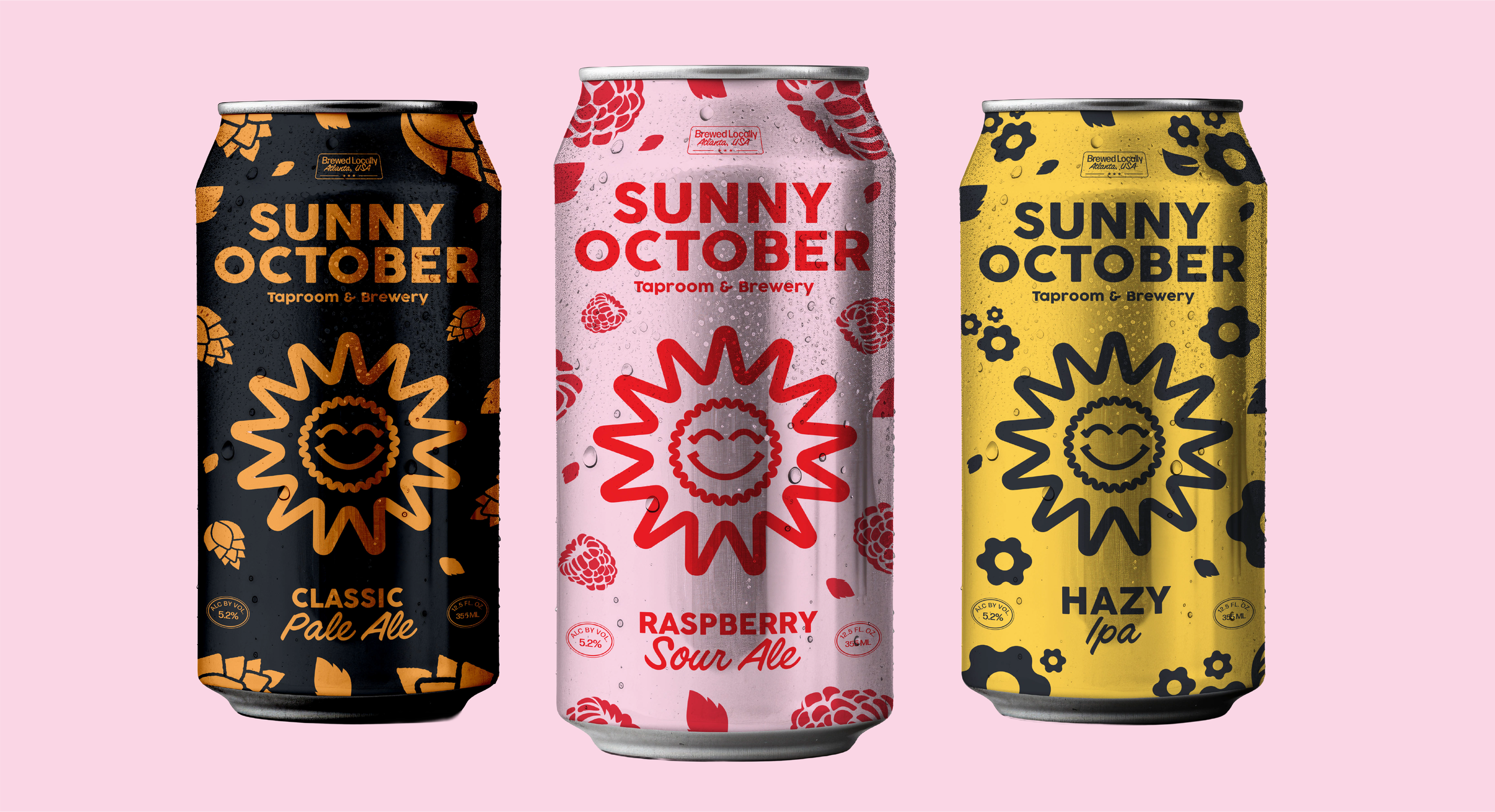
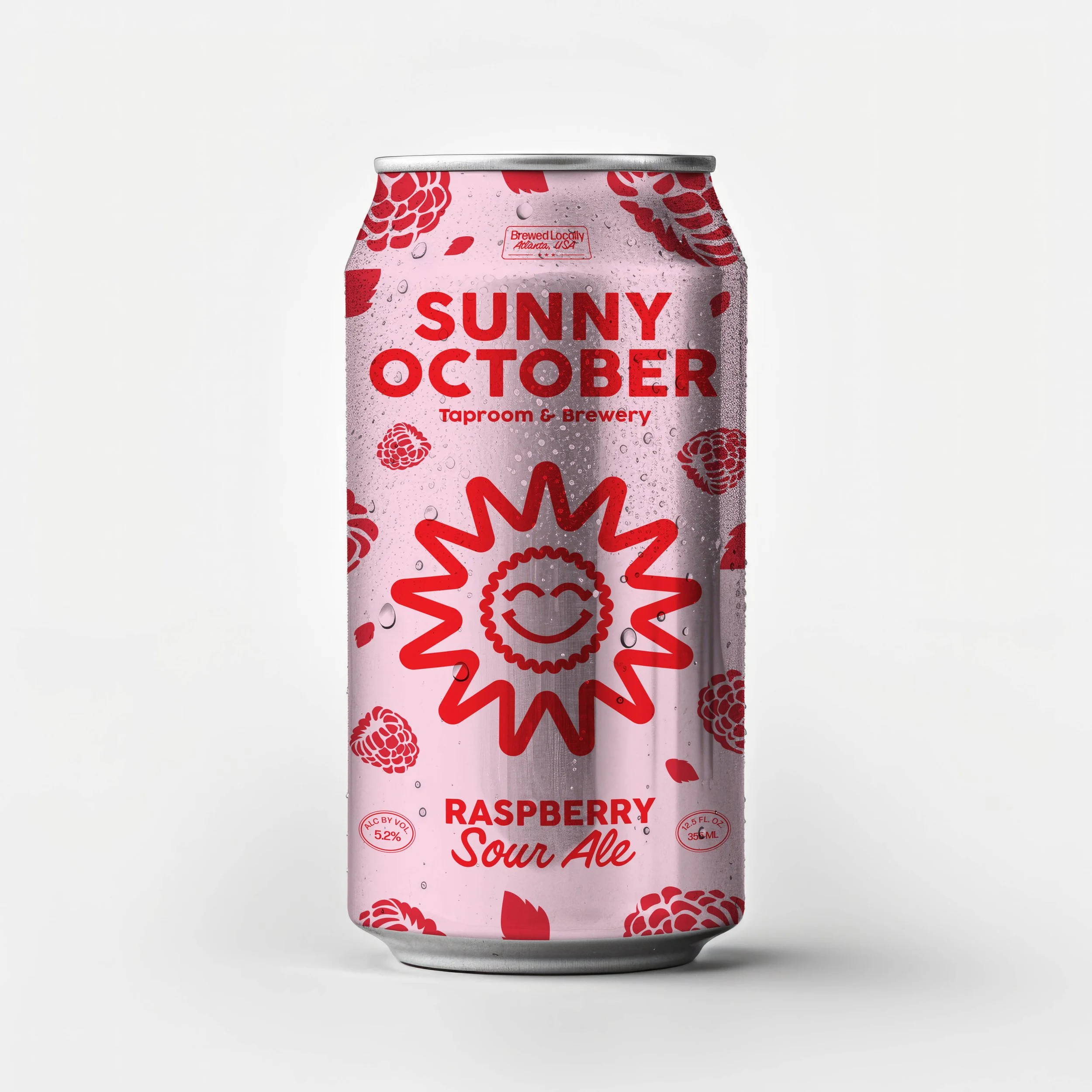
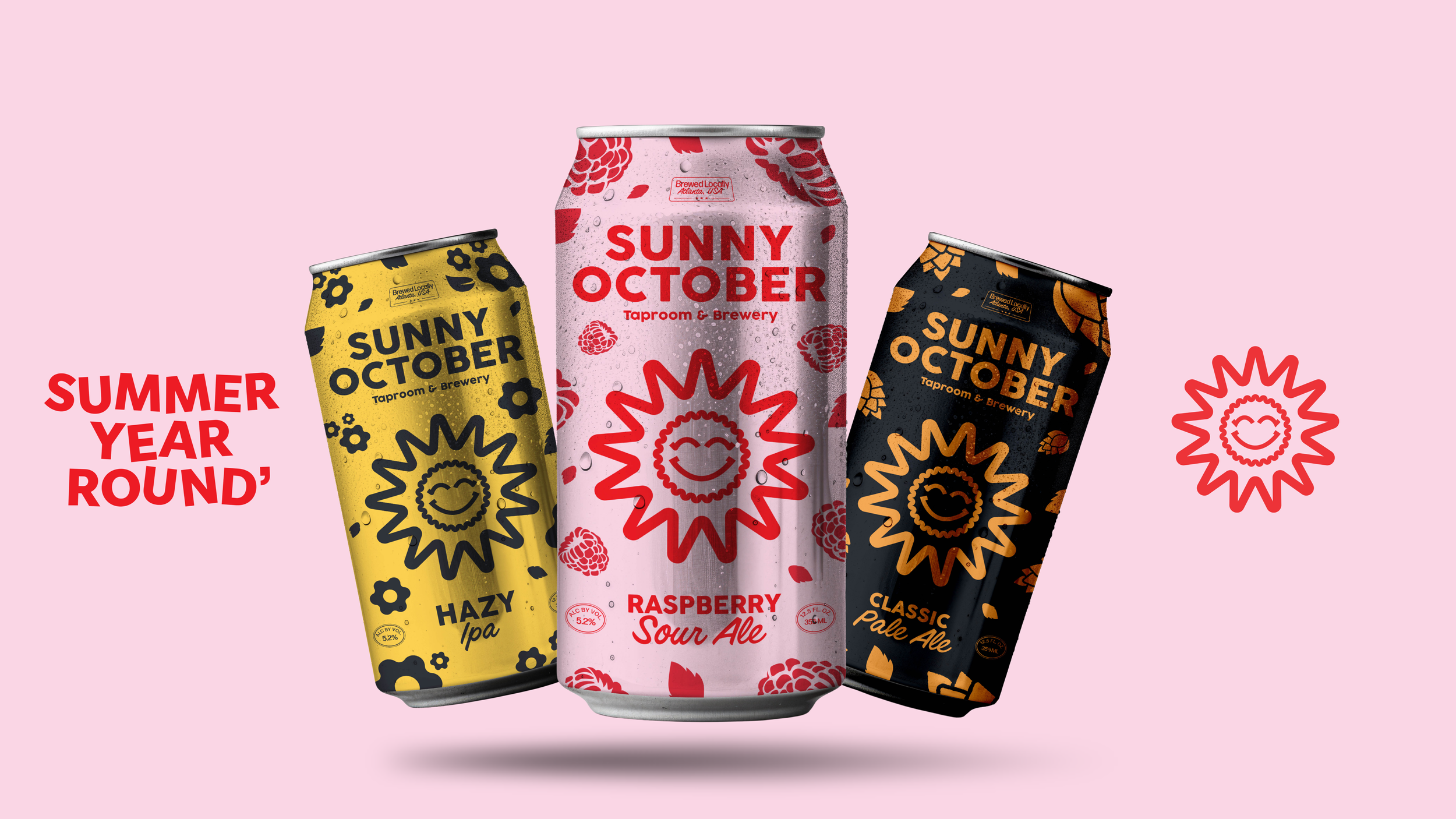
PACKAGING
The cans are where the whole brand comes to life. Each flavor gets its own color world, the Classic Pale Ale in warm gold on black, the Raspberry Sour in soft pink and red, the Hazy IPA in bright sunlit yellow. They look and feel different, but they're unmistakably part of the same family.
What holds it all together is the system. The sun mark sits front and center on every can, big and friendly, so the brand reads instantly from across the room or down the cooler aisle. Around it, hand-drawn illustrations tell you what's inside before you read a word, hops for the Pale Ale, raspberries for the Sour, flowers for the Hazy. The layout stays clean and confident on all three, with the wordmark up top and the flavor called out plainly at the bottom. Nothing is fussy and nothing is wasted.