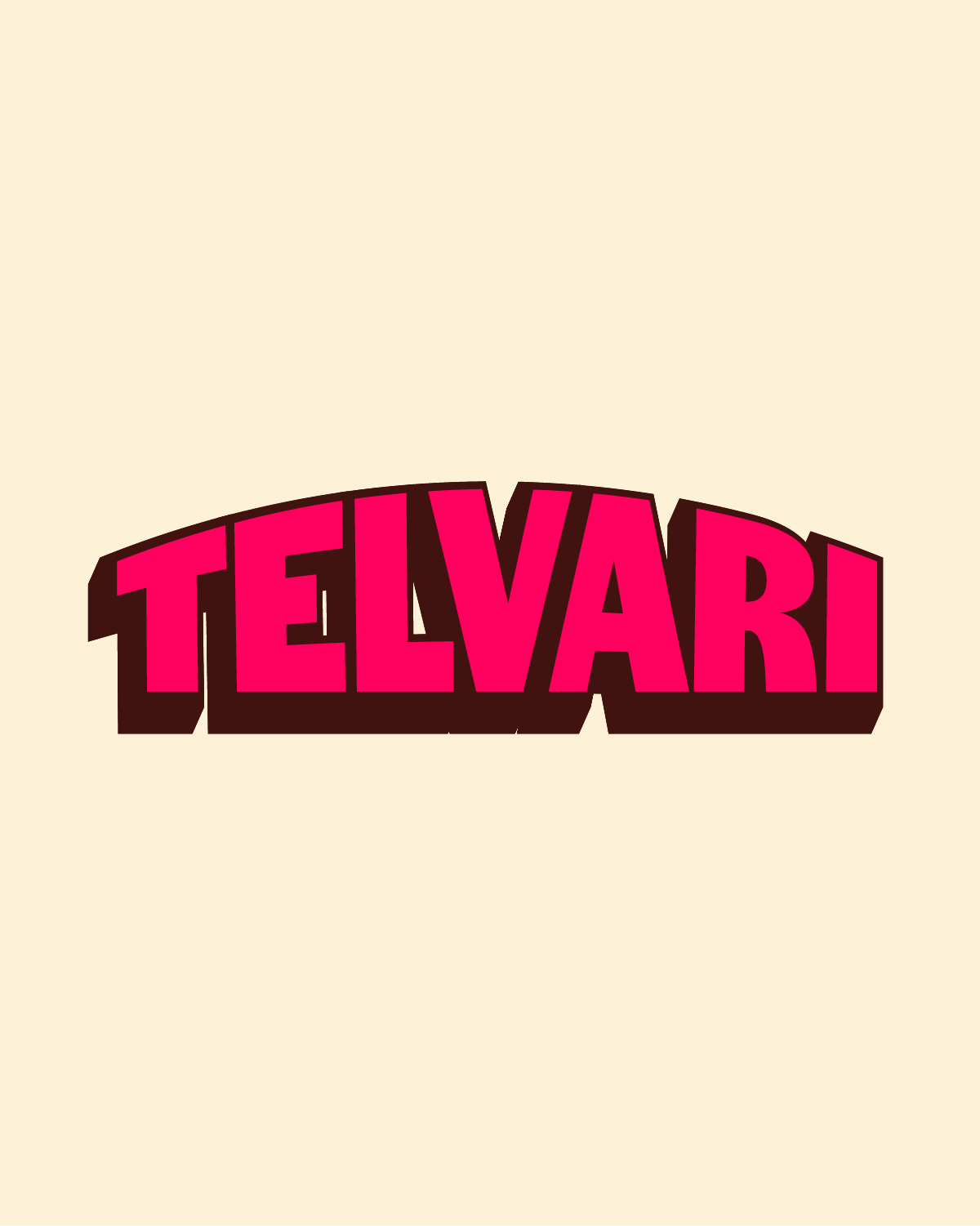
TELVARI HERBAL TEA
Mehul came to me with a hibiscus functional beverage that didn't have a brand yet.
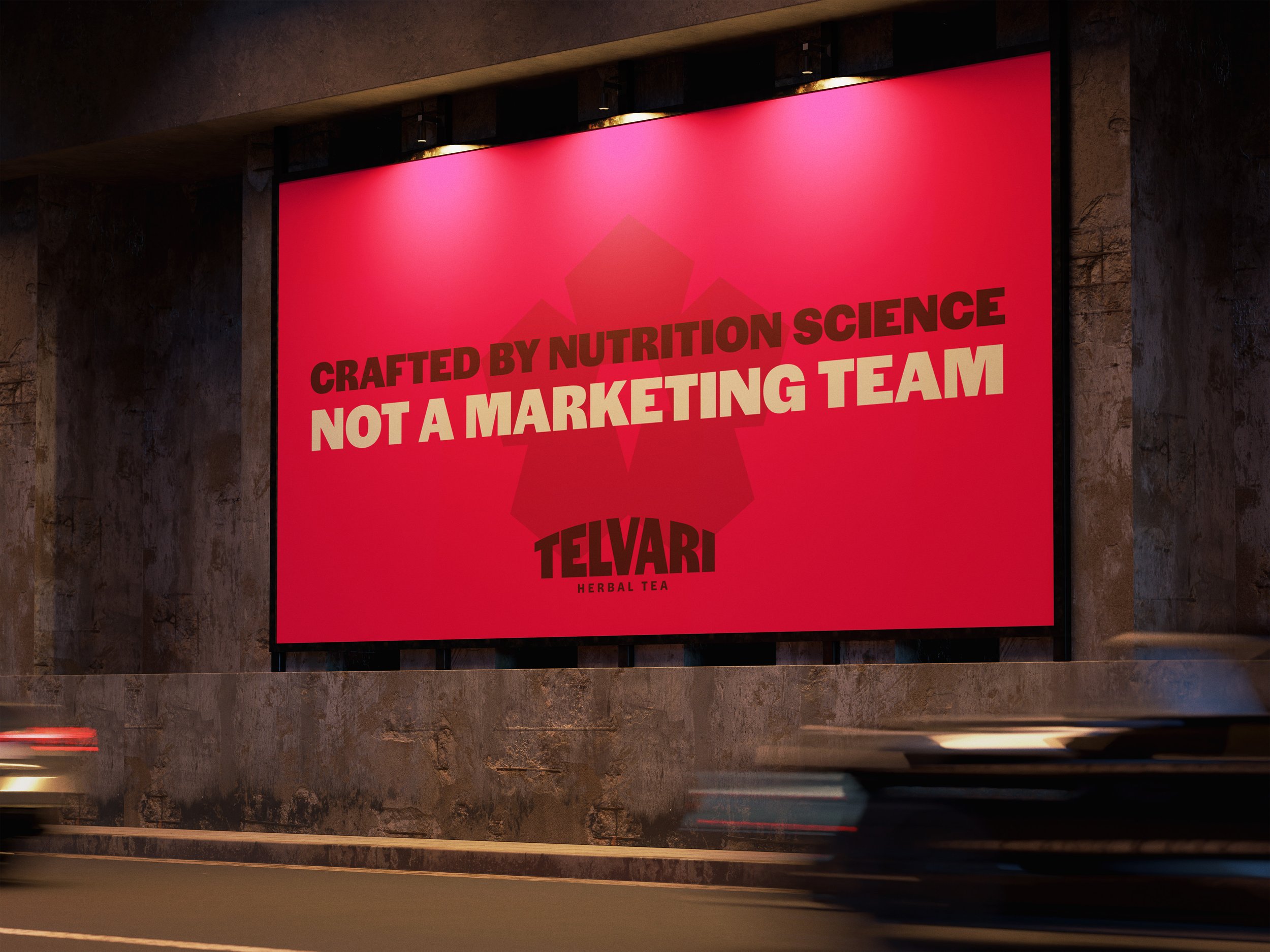
The functional beverage space is crowded. Most cans on the shelf promise the same things: better gut health, cleaner ingredients, more energy. Telvari needed to stand apart from that noise, with a brand bold enough to compete with bigger players and distinct enough to make hibiscus feel like the hero ingredient it actually is.
The challenge wasn't just making it look good. It was building a brand from scratch that could hold its own on a crowded shelf and give Telvari real credibility from day one.
Scope
- Brand Strategy
-Logo design
- Typography and color
- Packaging design
- Additional brand elements
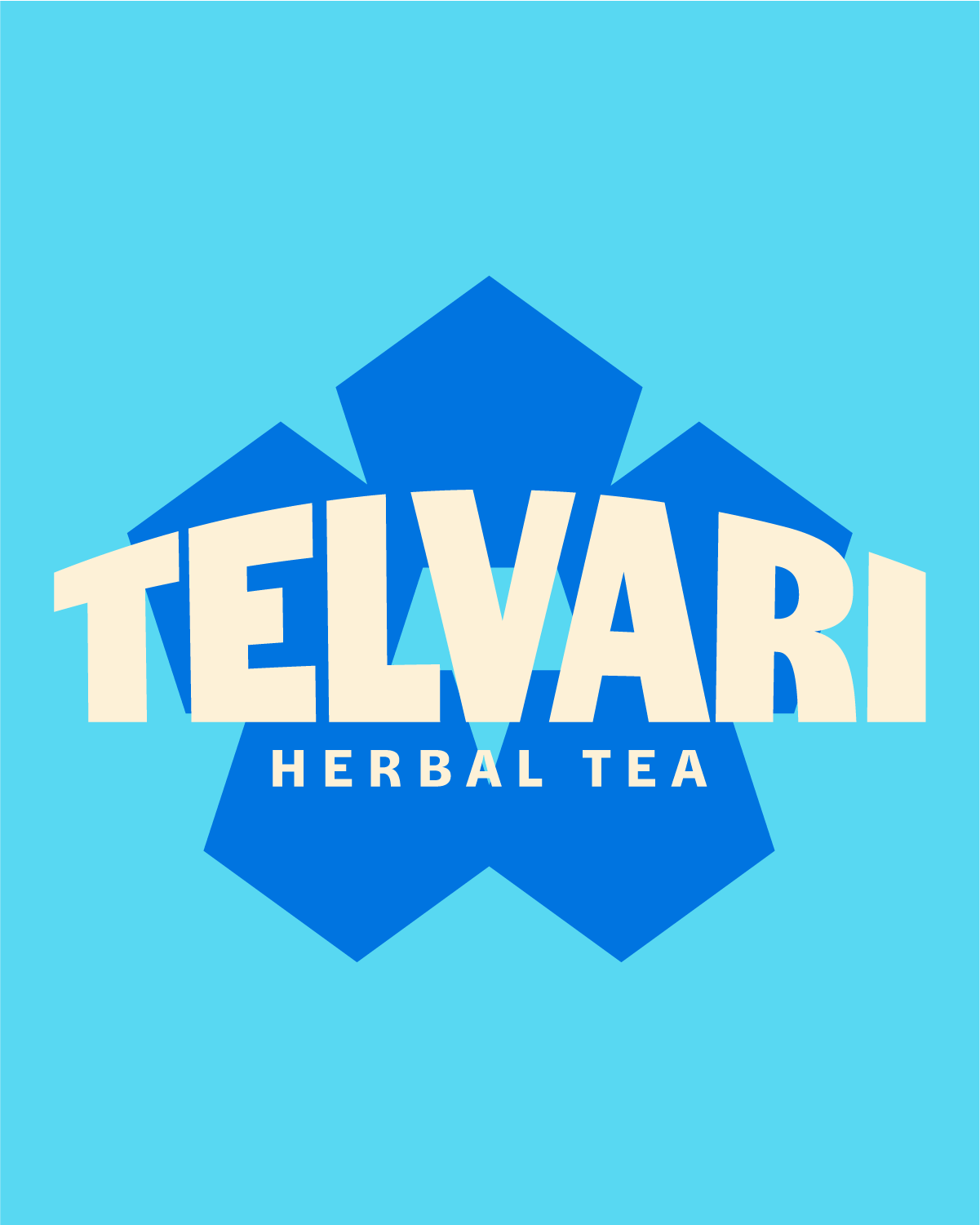
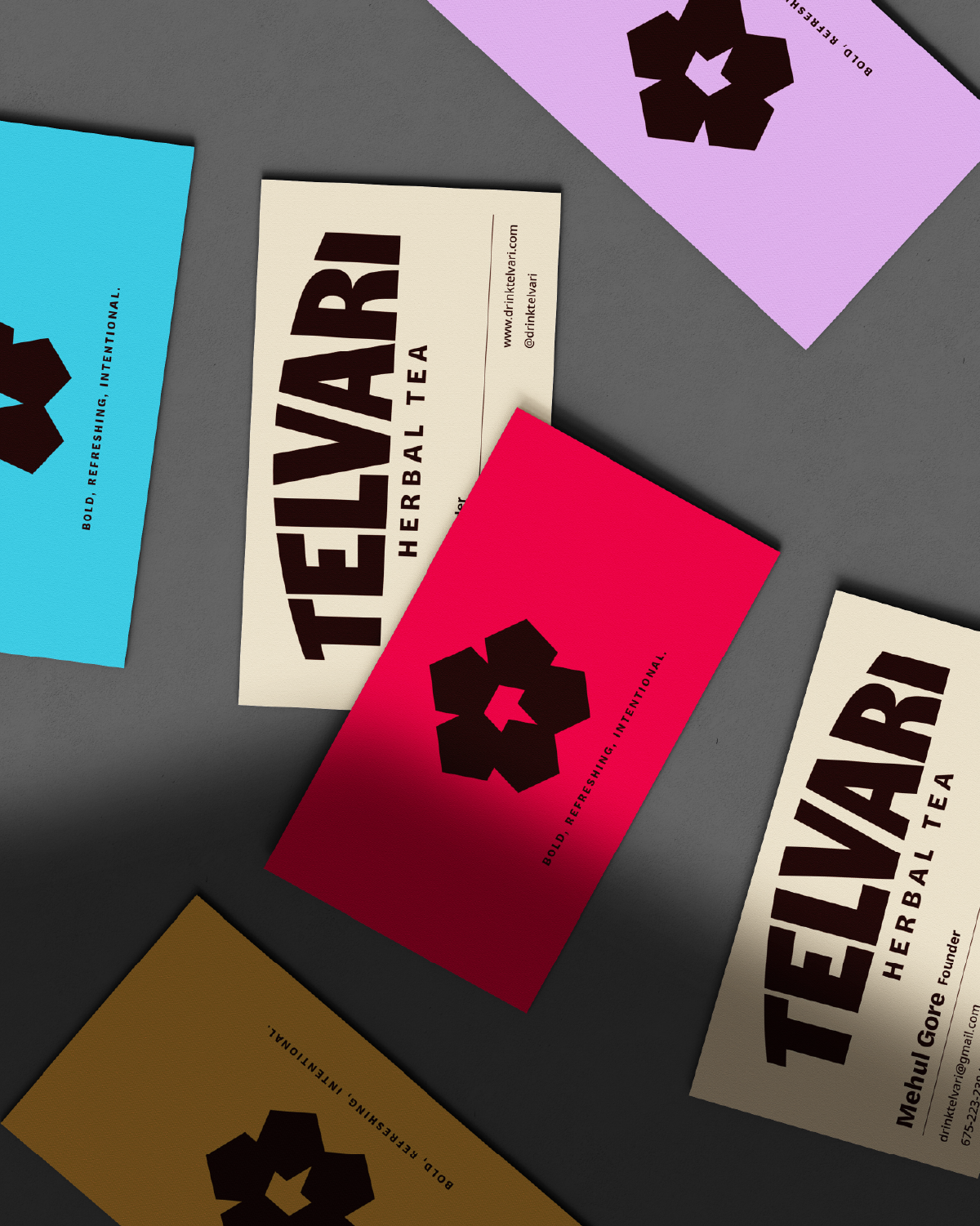
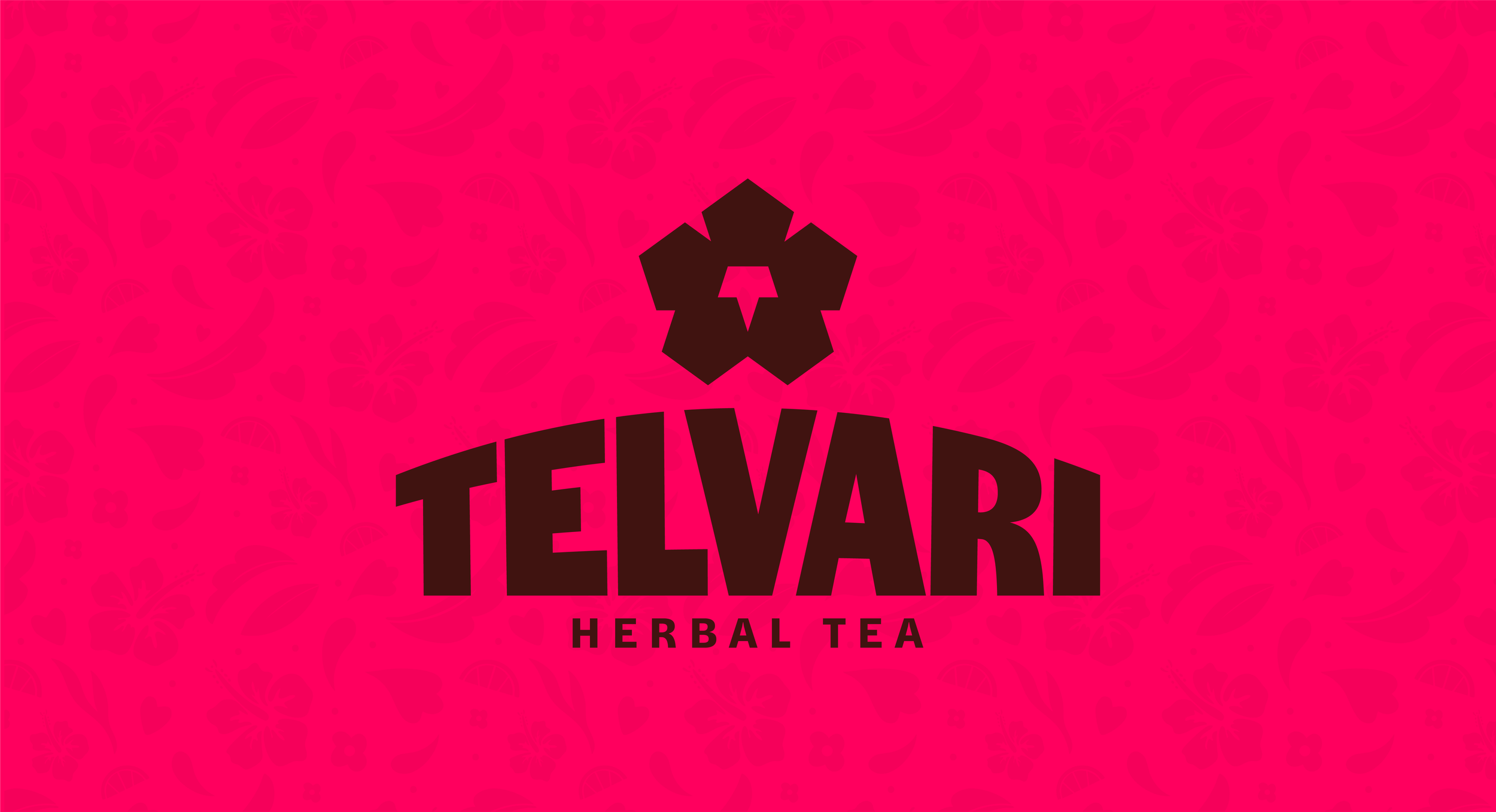
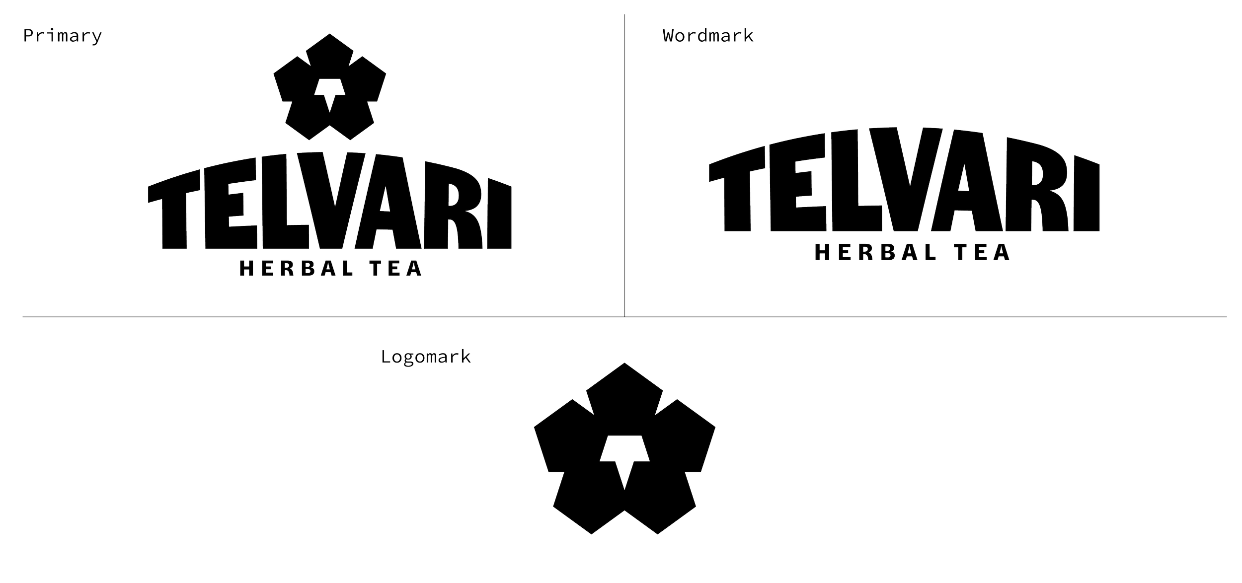
THE LOGO
The Telvari mark is built from pentagon shapes, a quiet nod to DNA molecules and the functional, science-backed nature of the drink. Those same shapes come together to form a hibiscus bloom, putting the hero ingredient front and center. At the center, the flower's stem resolves into a subtle "T," a signature hidden in plain sight.
The wordmark is bold and arched, built to command shelf presence and stand toe to toe with bigger, more established competitors. It carries just enough character to feel distinct, without pulling focus from the mark above it.

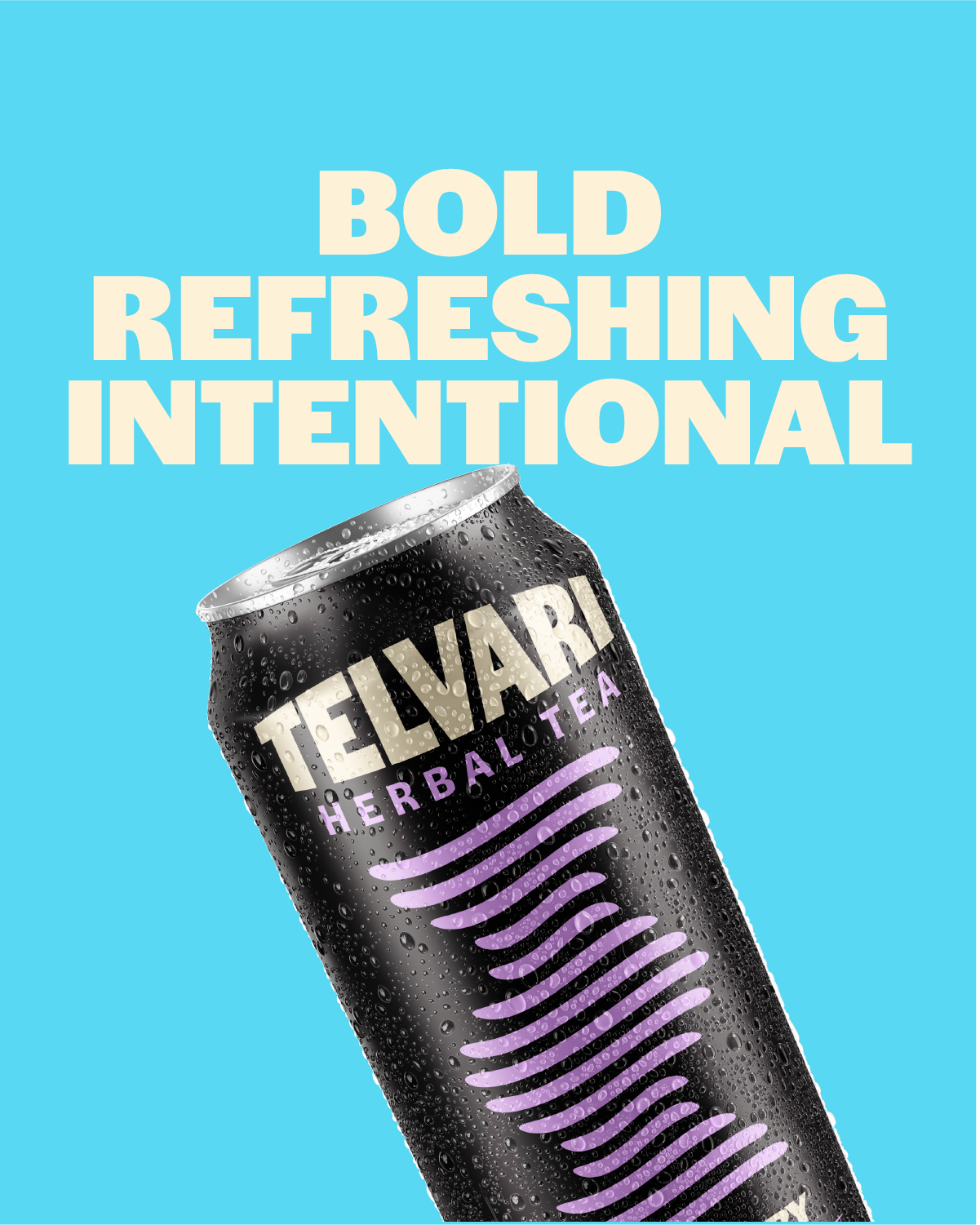
COLOR PALETTE
Hibiscus Red and Dark Maroon anchor the Telvari palette, pulling directly from the color of the flower and the natural hue of the drink itself. Sand, Light Blue, Yellow, Lavender, and Deep Blue round out the system as secondary colors, giving the brand range and vibrancy without losing the bold, ownable feel that makes Telvari stand out on a crowded shelf.
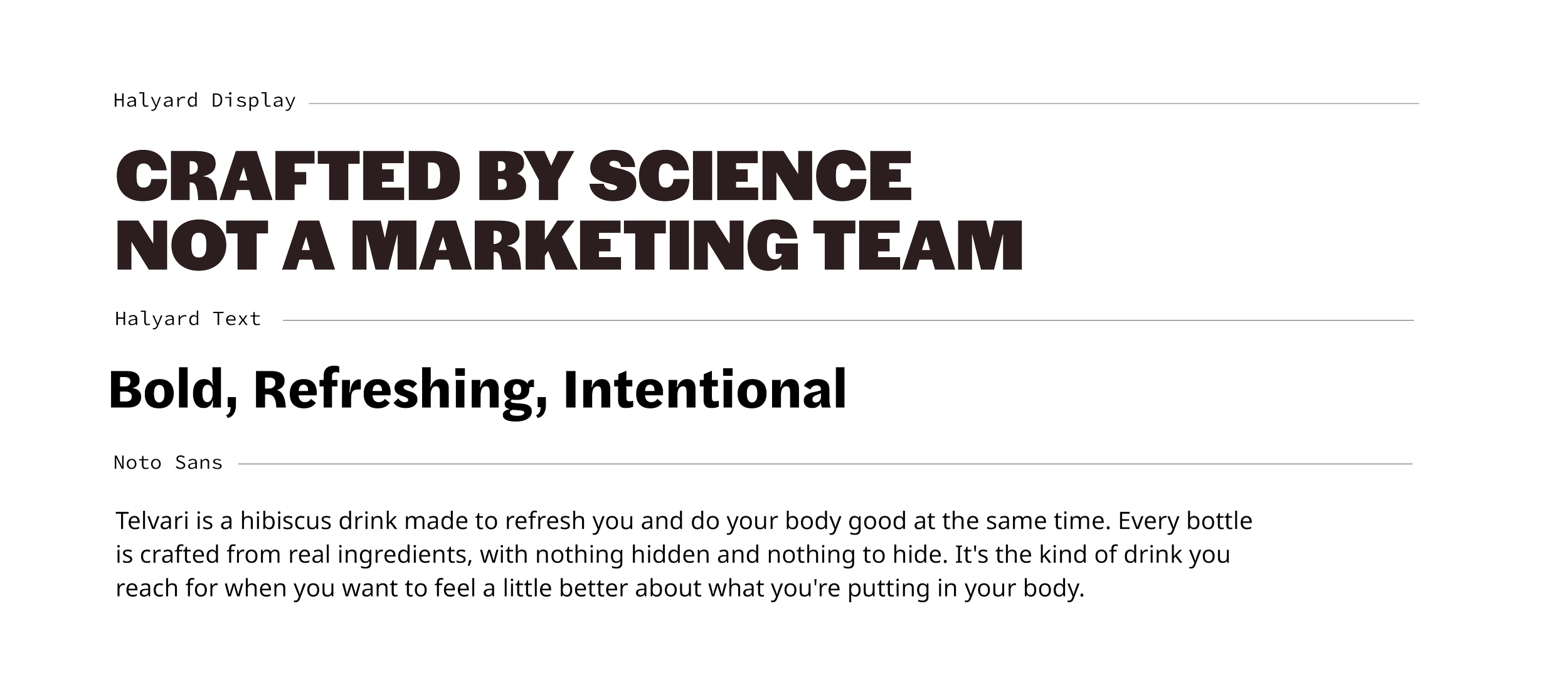
TYPOGRAPHY
Halyard Display handles headlines with bold, all-caps weight, giving Telvari a confident, declarative voice that backs up its functional claims. Halyard Text steps in for subheads, carrying the same boldness at a smaller scale. Noto Sans rounds out the system as the body font, keeping ingredient and product details clean and easy to read. Together they give Telvari a voice that's bold and science-backed, without ever feeling cold or clinical.
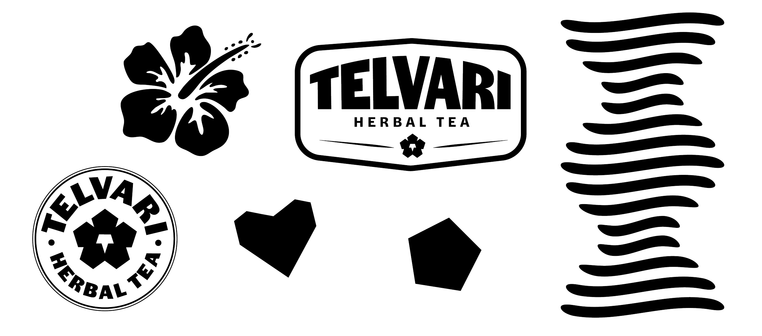
ASSETS
Beyond the primary logo, Telvari has a set of supporting assets, including illustrations, icons, and textures, that extend the brand across packaging and marketing while staying tied back to the same hibiscus and DNA motifs at the core of the identity.

PATTERNS
Telvari's pattern system is built from the same hibiscus, leaf, and DNA-inspired shapes found throughout the brand. The patterns add a layer of texture and personality to packaging and marketing materials, keeping the botanical story present even when the product itself isn't the focal point.

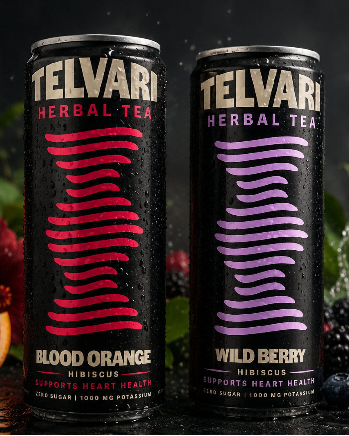
PACKAGING
The goal with the Telvari can system was to communicate real health benefits without making the drink feel too clinical and cold. A black base runs across every flavor, letting the wordmark and color-coded DNA helix do the talking. Blood Orange, Wild Berry, and Passionfruit are each tied to their own color, with the same wave motif from the DNA-inspired logo running down the can to keep every flavor visually connected to the core brand. Health claims like supports heart health, zero sugar, and the potassium content are kept front and center, but short and direct, so the can reads as a drink you'd actually want, not a supplement.